13 November 2026 · 5 min read
Rule of Thirds, Frames Within Frames, and Dutch Angles
Use three familiar composition tools with a reason. Learn when to place a face off centre, frame it through a doorway, or tilt the horizon.

You line up the grid, place the face on a third, and press record. The frame is tidy, but the scene still feels empty.
Composition guides can help you organise a picture. They can't decide what matters in it. That choice starts with the person, place, or action.
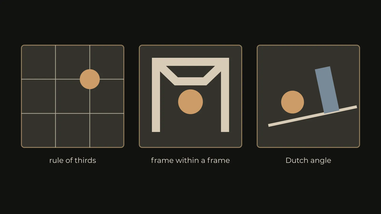
The rule of thirds, a frame within a frame, and a Dutch angle each change attention. Use them because they support a moment, not because a grid tells you to.
Decide what the viewer should notice first
Look away from the screen, then look back. Which shape catches your eye? It may be a face, but it may be a bright doorway behind it.
Before moving the camera, remove the easy distractions. Change a background object, close a curtain, or wait for a person to leave the edge.
A clear image often needs less arranging than expected. Start with one strong subject, then decide how the surrounding space should behave.
Our article on shot lists that follow emotion helps connect that choice to the scene.
The rule of thirds gives you a useful starting point
Divide the picture into three equal parts across and down. You now have two vertical lines and two horizontal lines.
Placing important details near those lines can create balance. A face might sit near one vertical line, with room in front of the person's gaze.
Nikon's composition guide shows the grid in practice. Treat the intersections as suggestions rather than tiny targets.
If the face moves slightly away from a line, the shot hasn't failed. Watch the relationship between the face, the background, and the empty space.
Leave room for looking and moving
A person looking right often benefits from some room on that side. The space gives their attention somewhere to go.
But less looking room can be useful too. It may make the frame feel cramped or suggest that someone is turning away.
The same applies to walking. Leave room ahead if the viewer needs to follow the route. Reduce it if you want a more pressured feeling.
Check what happens when the person stops. A frame built only for movement can feel unbalanced once the action settles.
Centre the subject when the scene needs it
A centred face can feel direct and calm. It can also feel formal, strange, or confrontational. The scene gives it meaning.
Use symmetry when the space supports it. A hallway, a doorway, or a shared table may offer a clear central line.
Don't move a strong centred frame onto a third just to obey advice. Compare both, then choose the version with clearer intention.
For a conversation, consider whether the centre makes someone feel exposed. That may be exactly what the scene needs.
A frame within a frame adds another boundary
A doorway can surround a person. So can a window, branches, a mirror edge, or the shape of a boat canopy.
The extra boundary can guide attention and suggest distance. It can make the viewer feel like a guest, an observer, or someone kept outside.
Look at the artwork for Raw Beauty of Kashmir below. The boat canopy surrounds a seated figure and the mountains beyond.

Watch the inner edges. A frame that touches a head awkwardly can look accidental. A dark shape may also become too heavy for the scene.
Move a little, then check again. Small changes in height can separate the face from a background line.
A Dutch angle tilts the world
A Dutch angle rolls the camera so that the horizon isn't level. It can make a familiar room feel unstable.
That doesn't mean every tense moment needs one. If you tilt constantly, the angle stops marking a change.
Use a level frame first, then compare a slight tilt. Ask what the tilt adds. If the answer is only energy, look for a more specific reason.
A person losing control, a disorienting discovery, or an unreliable viewpoint may support it. The acting and sound should still carry the scene.
Give the tilt room to cut
Decide whether the reverse angle should tilt as well. Matching every angle mechanically can create a repetitive rocking effect.
If you change the tilt during the scene, choose the turning point. Don't let a casual handheld drift make that decision for you.
Check vertical objects near the edges. Door frames and walls make even a small tilt very visible.
You can rotate a shot in editing, but the crop removes picture area. Compose with that loss in mind if a correction may be needed.
Test the choices with one simple action
- Ask someone to enter a room and sit down.
- Record the action with a centred, level frame.
- Repeat it with the person near a third.
- Move back and use the doorway as an inner frame.
- Try one deliberately tilted version.
- Watch all four without music, then compare the feeling.
Keep the action similar so that the composition is the main change. Then ask another person where their eyes went first.
There is no need for every version to succeed. The point is to notice what each choice actually does.
Before the next shoot, choose one visual rule for the scene. Keep it while it helps, and change it when the story gives you a reason.